Seeing Does Not Mean Understanding
July 8, 2026
- design
- communication
- accessibility
- ux
- semiotics
- explorations
In short
A sign does not communicate because it exists: it communicates when its meaning arrives, stays clear, and lets someone act.
Informing Is Not the Same as Communicating
There is a subtle but decisive difference between informing and communicating.
Information can exist on its own. It is a datum, a signal, a trace, an organized form that contains something.
A number on a screen. An icon in an interface. A word written on a sign. A color associated with a state.
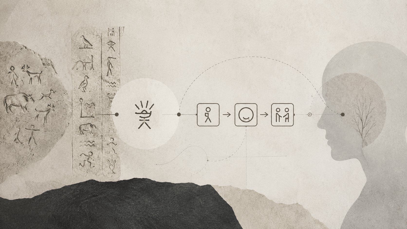
Long before digital interfaces, humans were already looking for ways to make meaning travel through visible forms. Cave paintings, hieroglyphs, ritual or public symbols already had this role: communicating something in a simple, recognizable way, often without relying on writing as we understand it today.
They were not “icons” in the modern sense, but they faced the same problem: making meaning legible to someone else.

Horse in the Lascaux caves. Image from Wikimedia Commons, public domain.

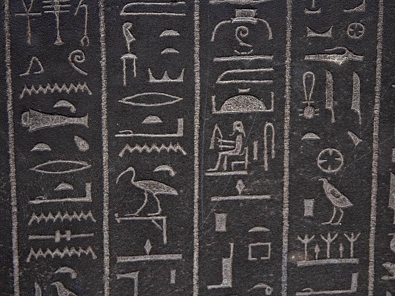
Egyptian hieroglyphs at the British Museum. Photo by Jon Sullivan from Wikimedia Commons, public domain.

All of this can be correct, visible, orderly.
And still fail to communicate.
To inform is to produce a sign. To communicate is to make meaning arrive.
Communication only begins when that information crosses a distance.
For me, this reflection did not begin only in front of an interface.
It also began by watching Lisa.
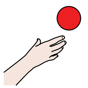
Lisa needs AAC, Augmentative and Alternative Communication. It means using tools, gestures, images, symbols, boards, devices, or apps to support or replace spoken language when speech is not enough, does not arrive, or is not available.
When someone communicates through a pictogram, the problem of meaning stops being theoretical.
That sign has to carry the weight of a need, a choice, a desire. It has to be clear enough to let someone say something about themselves.

I
want

drink

help
I wrote more directly about Lisa and her diagnosis in the post about ADNP syndrome. Here I start from there, but try to widen the lens: what happens when we treat every sign as a small act of access?
The Distance Between Intention and Understanding
That distance is not only physical. It is the distance between:
- the person designing and the person interpreting
- the person who already knows and the person seeing it for the first time
- a technical context and a human context
- an intention and real understanding
In between, there is not emptiness. There is the most interesting problem: the transfer of meaning.
Intention
what I want to make possible
Sign
the visible form chosen
Context
where and when it appears
Interpretation
the meaning reconstructed
Action
what the person can do
Communication works when this chain remains legible all the way through.
If it breaks at any point, the information can be correct and still fail to arrive. It can be elegant and still not be understood. It can be technically coherent and still fail the moment it is read by someone different from the person it was imagined for.
Why Interfaces Make the Problem Visible
This happens constantly in interfaces.
An icon feels obvious to the person who chose it because it lives inside a history: a habit, a visual culture, an operating system, an age, a profession.
But that same icon can become ambiguous for someone who does not share that background.
The problem is not only aesthetic. It is cognitive.
Every sign carries a load. Some signs are almost transparent: they show what they mean. Others are conventions: they work because we learned them. Others survive as cultural fossils, continuing to indicate an action even when the object they came from has disappeared from everyday experience.
| Type of sign | How it works | Risk |
|---|---|---|
| Transparent | it resembles what it points to | it feels universal, but is not always universal |
| Conventional | it works because it has been learned | it excludes people who do not know the convention |
| Cultural fossil | it comes from past objects or habits | it loses meaning as generations change |
| Contextual | it depends on where it appears | its meaning shifts when the flow or environment changes |
Transparent
shows what it means
Conventional
works because it was learned
Cultural fossil
comes from past objects
Contextual
changes with the flow
The floppy disk for saving. The magnifying glass for search. The trash can for deletion. The heart for appreciation. The bell for notifications.
They are useful signs, as long as their meaning remains shared.
What Semiotics, AAC, and Accessibility Tell Us
This idea has fairly solid roots.
In the semiotics of Charles Sanders Peirce, a sign is never only a form: it relates something that represents, something it refers to, and an interpretation. Without interpretation, the sign remains incomplete.
In the world of graphical symbols, ISO 9186 exists precisely to test comprehensibility: drawing a pictogram is not enough, you need to verify whether it actually communicates the intended message.
In AAC, ASHA describes augmentative and alternative communication as forms of communication that support or replace spoken language, from low-tech options such as gestures and picture boards to apps and speech-generating devices (AAC in Early Intervention).
ARASAAC, which many families and professionals know well, provides thousands of open-source pictograms for Augmentative and Alternative Communication (ARASAAC).
In interface design, Nielsen Norman Group notes that truly universal icons are rare, and that text labels help reduce ambiguity (Icon Usability).
But labels are not a neutral solution either. They carry language, culture, literacy, technical familiarity. They can clarify an icon for one person and create a new distance for another.
And in W3C cognitive accessibility guidance, icons work better when they are familiar, placed next to the content they represent, and able to carry one main meaning (Use Icons that Help the User).
In different ways, all these sources point to the same thing: meaning is not a private property of the sign. It is a relationship.
When a Correct Sign Is Still Not Understood
For years we have treated many interfaces as if meaning were embedded in form.
I draw a symbol.
I put it in the right place.
The user will understand.
But understanding does not mean recognizing a shape. It means connecting that shape to an intention, an action, a consequence.
It means knowing what will happen after pressing, following, avoiding, choosing.
The transfer can fail in different ways:
| Fragile point | What happens |
|---|---|
| Unclear intention | the system knows what it wants to do, but does not make it evident |
| Ambiguous sign | the form allows multiple interpretations |
| Insufficient context | the information that makes the sign legible is missing |
| Uncertain action | the person does not know what will happen next |
| Hidden consequence | the cost of the mistake is discovered too late |
In this sense, communication is not the simple emission of a message. It is a continuous verification of transfer.
Questions That Show Whether Meaning Arrives
When I design a sign, a label, a button, or a flow, the most useful questions are not only “is it visible?” or “is it consistent?”.
They are more uncomfortable questions:
- Did the meaning arrive?
- Did it arrive to the right person?
- Did it arrive in the right context?
- Did it arrive clearly enough to allow safe action?
- What happens if the person does not share my visual culture?
- What happens if they are tired, rushed, anxious, distracted?
The quality of communication is not in the isolated sign. It is in the sign’s ability to survive the journey.
When a Sign Becomes Access for Someone
These questions become even more important when we talk about accessibility, neurodivergence, public services, health, school, mobility, digital identity, administrative procedures.
In those contexts, an unclear sign is not just a graphic flaw.
It can become friction. Exclusion. Error. Dependence on someone else.
In AAC this becomes evident: a pictogram is not decoration, not aesthetic simplification, not an “image for children”. It can be access to communication.
So it is not enough to ask whether something can be seen. We need to ask whether something can be transferred.
From Sign to Action: A Simple Model
Communication ≈ information × context × understanding
If one of the factors tends toward zero, the result moves toward zero.
Correct information without context remains fragile. Rich context without understanding remains noise. Partial understanding may be enough for exploration, but it is not always enough for safe action.
It is the same reason why, when I wrote about the w@lter logo, I ended up talking more about legibility than aesthetics. And why cognitive overload keeps coming back when I think about AI, interfaces, and tools: understanding costs energy.
The Final Test: Removing Our Own Experience
A good communication system should not limit itself to producing signs that are beautiful, coherent, or recognizable.
It should ask how well those signs can preserve their meaning when audience, culture, age, cognitive abilities, technological familiarity, and context of use change.
One simple question can help:
If I remove my own experience from the center, does this sign still work?
Maybe part of contemporary design needs to return there: not to the decoration of information, but to the responsibility of meaning.
Because between what we wanted to say and what is actually understood lies the whole space of design.